Shopify Ecommerce Design Case Study - +307% Conversion Rate
A full Shopify redesign for a premium beauty and wellness brand, focused on improving trust, strengthening the conversion flow, and making the mobile shopping experience feel as polished as the product itself.
Project Overview
Noravele is a beauty and wellness brand with strong creative direction and a loyal customer base. This beauty brand Shopify store design project began because the brand had built real momentum, but the Shopify store was not keeping pace. Visitors arrived with intent and left without converting, not because the products were the problem, but because the store experience was not living up to the brand.
We were brought in to redesign the storefront from the ground up: rethinking the homepage first impression, rebuilding the product page structure, tightening the mobile UX, and strengthening the trust signals that support purchase decisions at every stage of the journey.
The Problem
The old store had the foundations of a strong brand but was not converting that brand equity into sales. Visitors were browsing but not buying. The core issues were clear:
- The homepage did not create a strong enough premium first impression
- The shopping experience lacked clear hierarchy, it was hard to know where to go next
- The product page was not doing enough to support the buying decision: trust signals were weak and conversion logic was absent
- On mobile, where the majority of traffic arrived, the experience felt unfinished and difficult to navigate
- The overall visual presentation did not match the brand positioning Noravele had built elsewhere
What We Found
Before touching a single design element, we audited the existing store, session recordings, heatmaps, and analytics. The findings were specific:
- The homepage hero was not communicating the brand's premium positioning within the first few seconds
- Trust signals, reviews, ingredients, guarantees, were buried below the fold or missing entirely from product pages
- Page hierarchy was unclear: users were not being guided from interest to intent to action
- The product page layout was not structured around the purchase decision, key information was in the wrong order
- Mobile scroll depth was low, suggesting users were not engaging past the first screen
- The visual presentation was inconsistent with a premium beauty brand at its price point
What We Changed
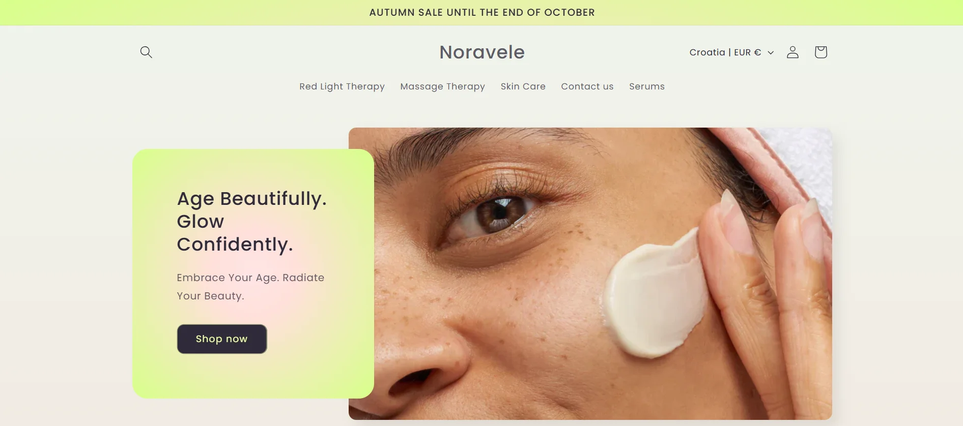
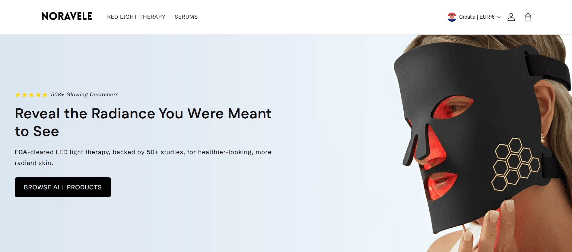
Homepage and first impression
The homepage was redesigned to communicate the brand's premium positioning immediately. The hero section was rebuilt around a clear brand statement, a strong visual, and a single clear path forward. Collection navigation was simplified so visitors always knew where to go next.
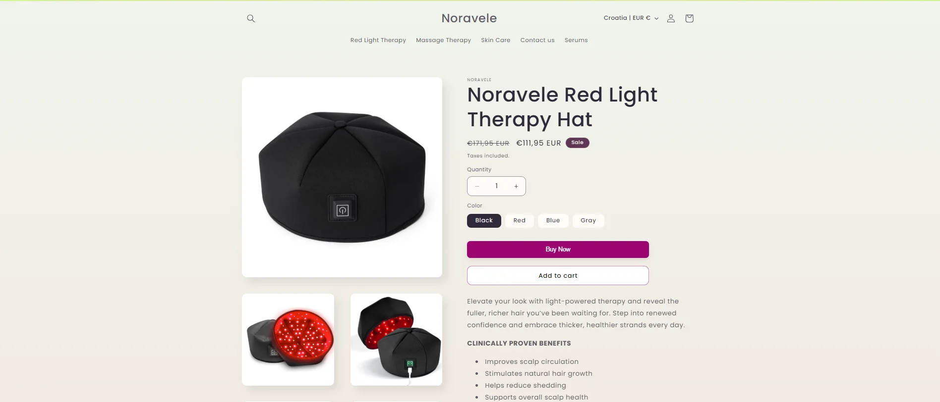
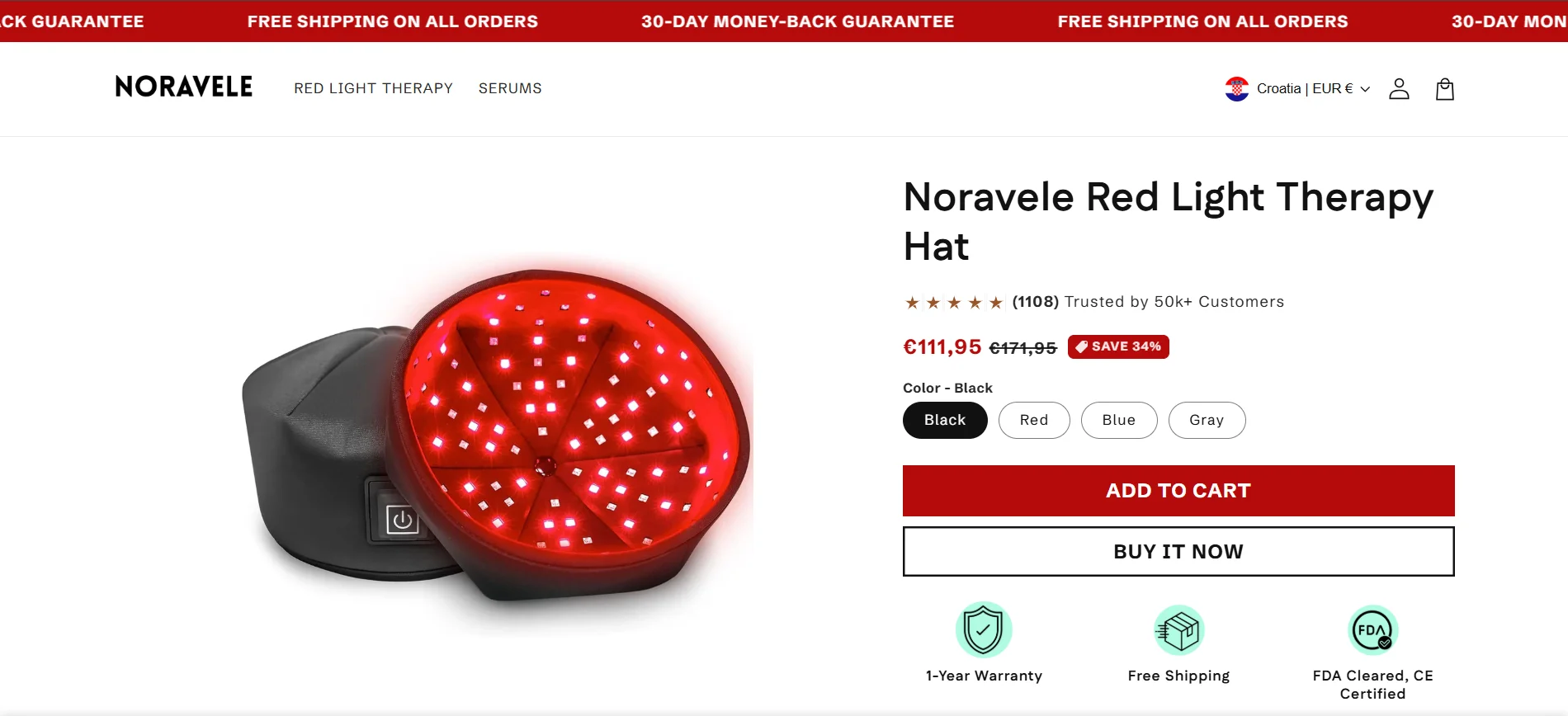
Product page experience
The product page was rebuilt around the purchase decision. Reviews and social proof moved above the fold. Key product details, ingredients, and trust signals were reordered to answer objections in the natural order visitors encounter them. The add-to-cart interaction was made more prominent and frictionless.
Mobile shopping experience
This Shopify mobile experience redesign treated mobile as the primary design environment, not an afterthought. The mobile product page was rebuilt to be easy to navigate, quick to scan, and clear at every interaction point. Tap targets were enlarged, content was tightened, and the path from product to cart was made shorter.
Trust and premium positioning
Every page was reviewed for trust signals. Review counts, star ratings, ingredient highlights, and brand values were surfaced earlier and more consistently. The visual treatment across the store was elevated to match the brand's pricing and positioning.
Conversion flow
The path from landing to cart was shortened and clarified. Unnecessary friction was removed. CTAs were made more consistent and more visible at every stage of the shopping journey.
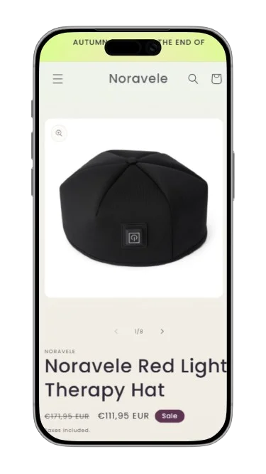
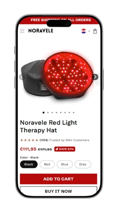
Before vs After
This ecommerce store redesign before and after shows three direct comparisons of exactly what changed: homepage, desktop product page, and mobile experience.
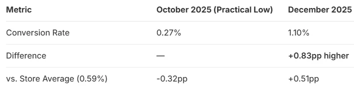
The Results
The Shopify conversion rate improvement results were measured 60 days post-launch against the same period prior to the redesign.
More visitors completing a purchase
More shoppers moving product to cart
Time to measurable results
Why It Worked
The results came from treating design as a conversion tool, not just an aesthetic one. Every decision was made with the shopper's journey in mind, not just how the store looked, but how it felt to move through it.
- A stronger homepage first impression established trust before the visitor reached a product page
- Clearer hierarchy reduced hesitation, shoppers always knew what to do next
- Moving trust signals earlier on the product page removed doubt at the most critical moment in the buying journey
- A more refined mobile experience reduced friction for the channel delivering the most traffic
- Consistent premium execution across every touchpoint made the brand feel more credible at its price point
- Shorter path from product to cart meant fewer opportunities to abandon
Let's Build Your
Success Story
Get a free strategy call and find out exactly how we'd approach your store.
Book a Free Call